
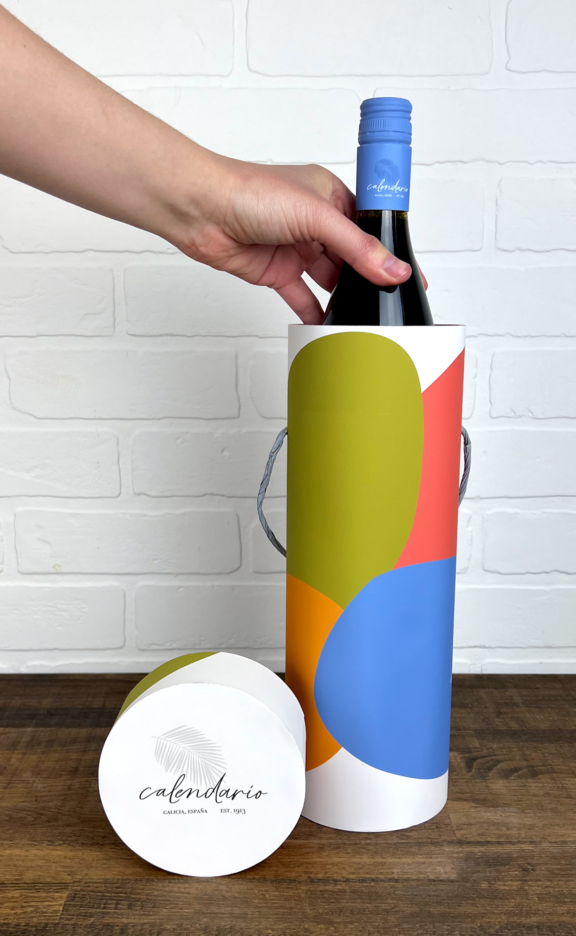
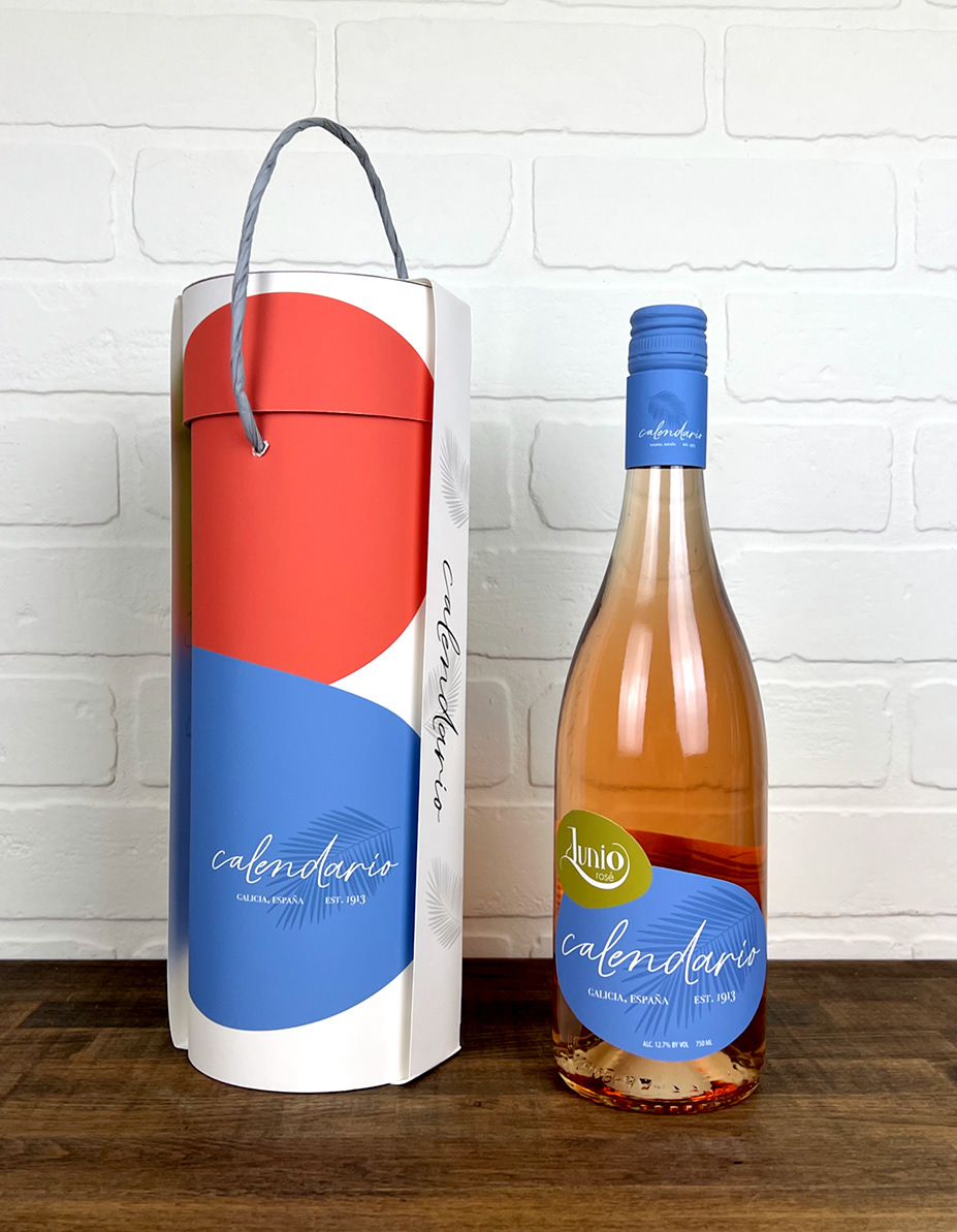
Goal: Create three type-based wine labels for one brand. Labels must include found type, modified type, and hand generated type. Include a specialty box for one of the bottles.
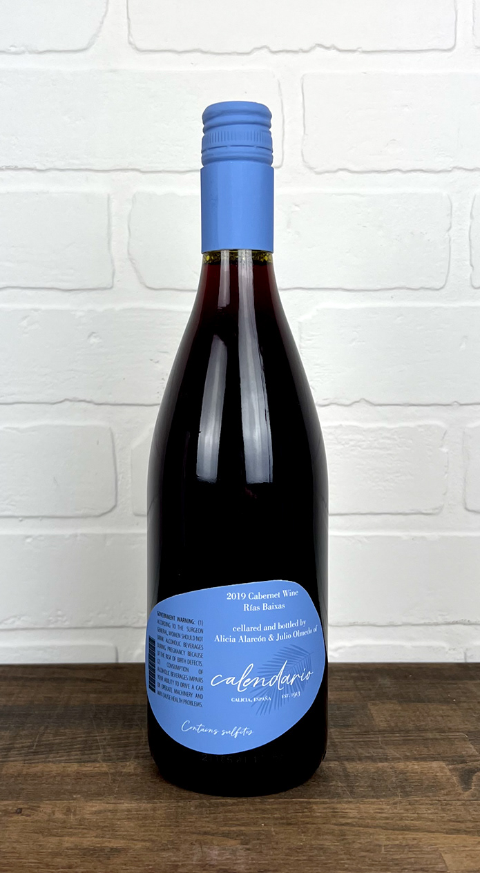
Brand Story: Calendario is a vineyard in the northwest coastal state of Galicia in Spain. Calendario means calendar in Spanish. They produce a different variety of wine for each month of the year. Calendario wants users to feel a relaxation in every sip—a vacation in every bottle.
Audience: young adults, post college-party phase, want to feel cool and sophisticated but not boring, not super feminine; appeals to both men and women, people who choose based on labels (eye-catching color)
Voice: clean, sophisticated, geometric, bold
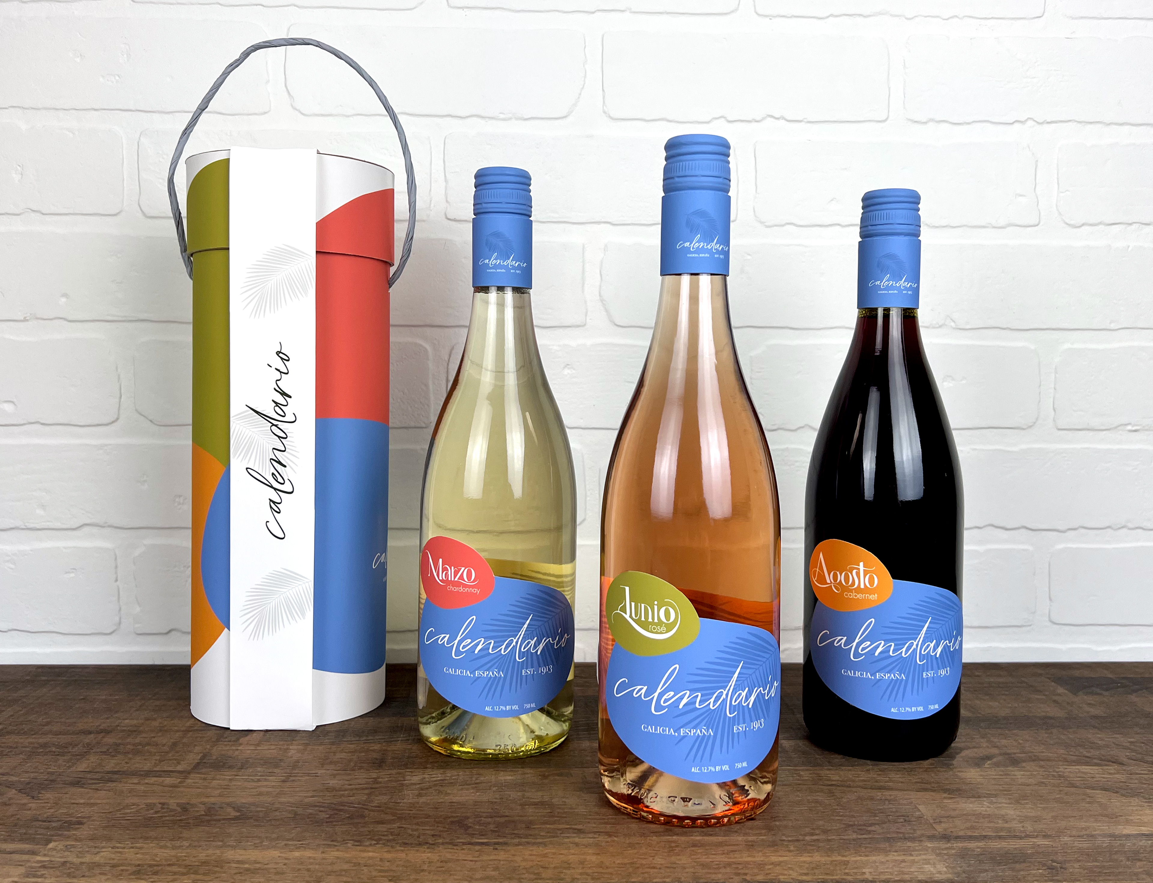
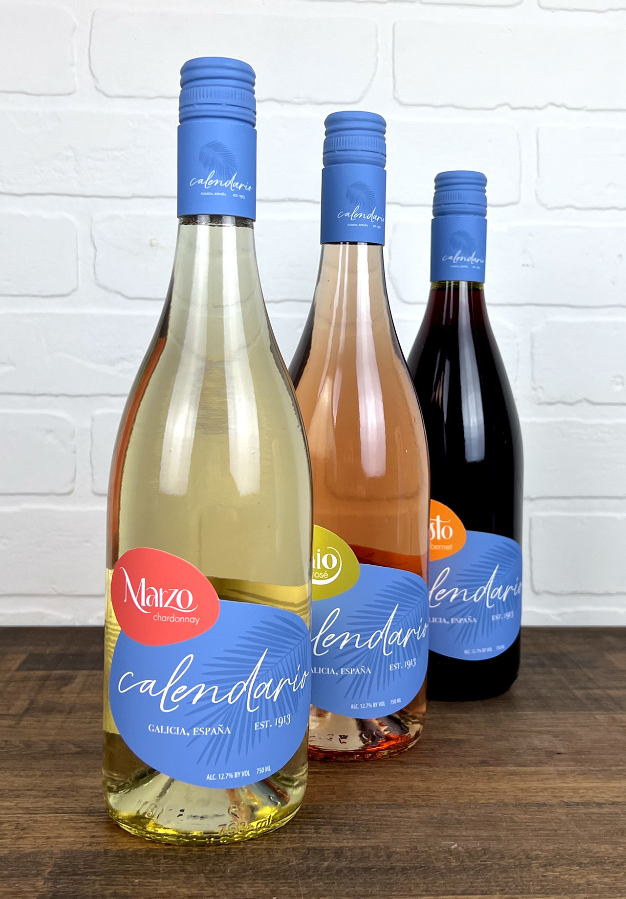
I carefully mixed acrylic paint to precisely match the neck label I printed in order to create a seamless transition at the top of my bottles.
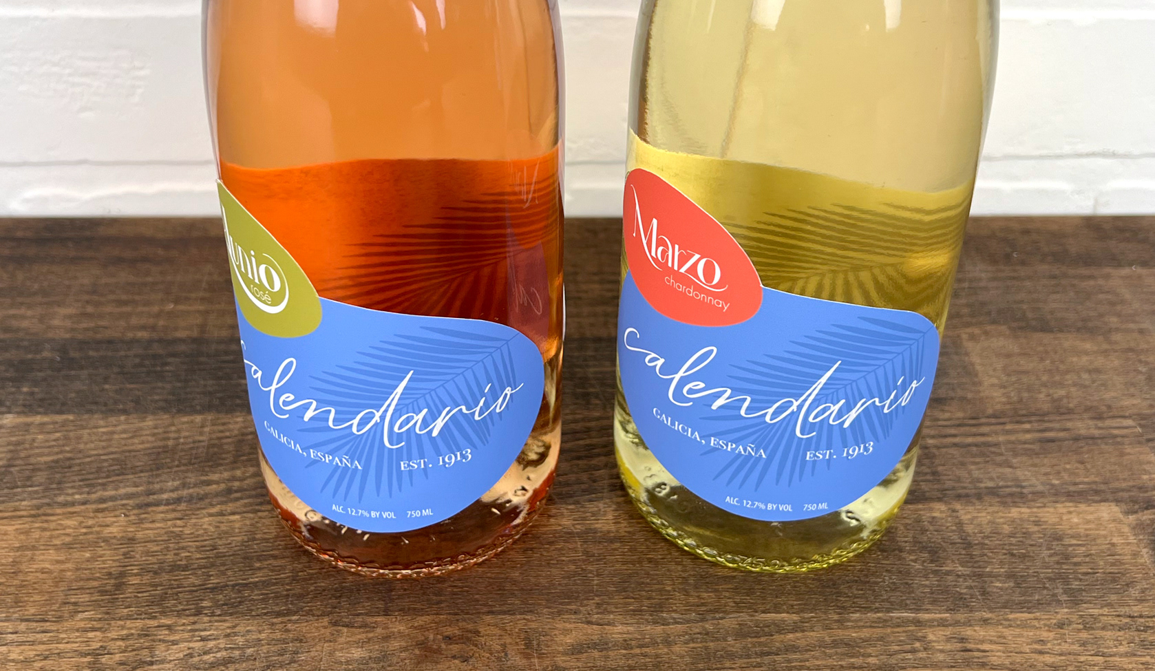
I thoughtfully crafted the labels to have a Phoenix canariensis palm leaf showing through the lighter varieties' bottles. This type of palm tree thrives in Galicia.
I created a motion graphic for an Instagram advertisement that includes a logo reveal.
Flip through to view a full case study and the progression of my label designs.