Goal: Develop a complete visual identity for a brand of your creation that establishes and communicates the proposed brand's values, audience, and context.
Brand Story: FAB! is a company that specializes in heirloom beans. Their goal is to make heirloom beans exciting for a growing market. They are a web-based retail store that provides beans, subscription boxes, recipes, education, and more.
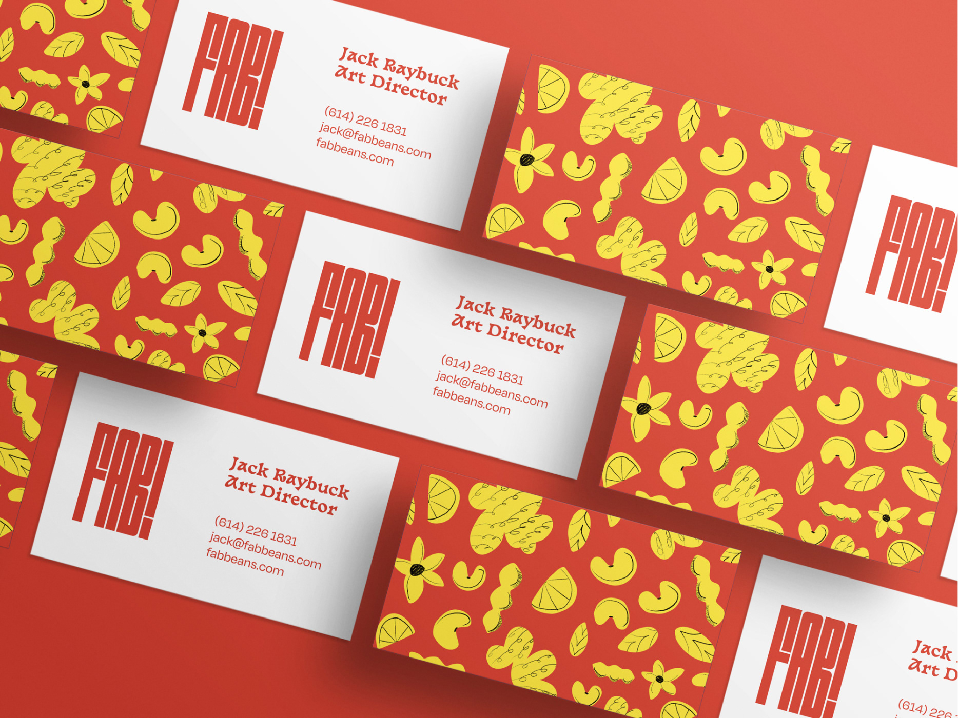
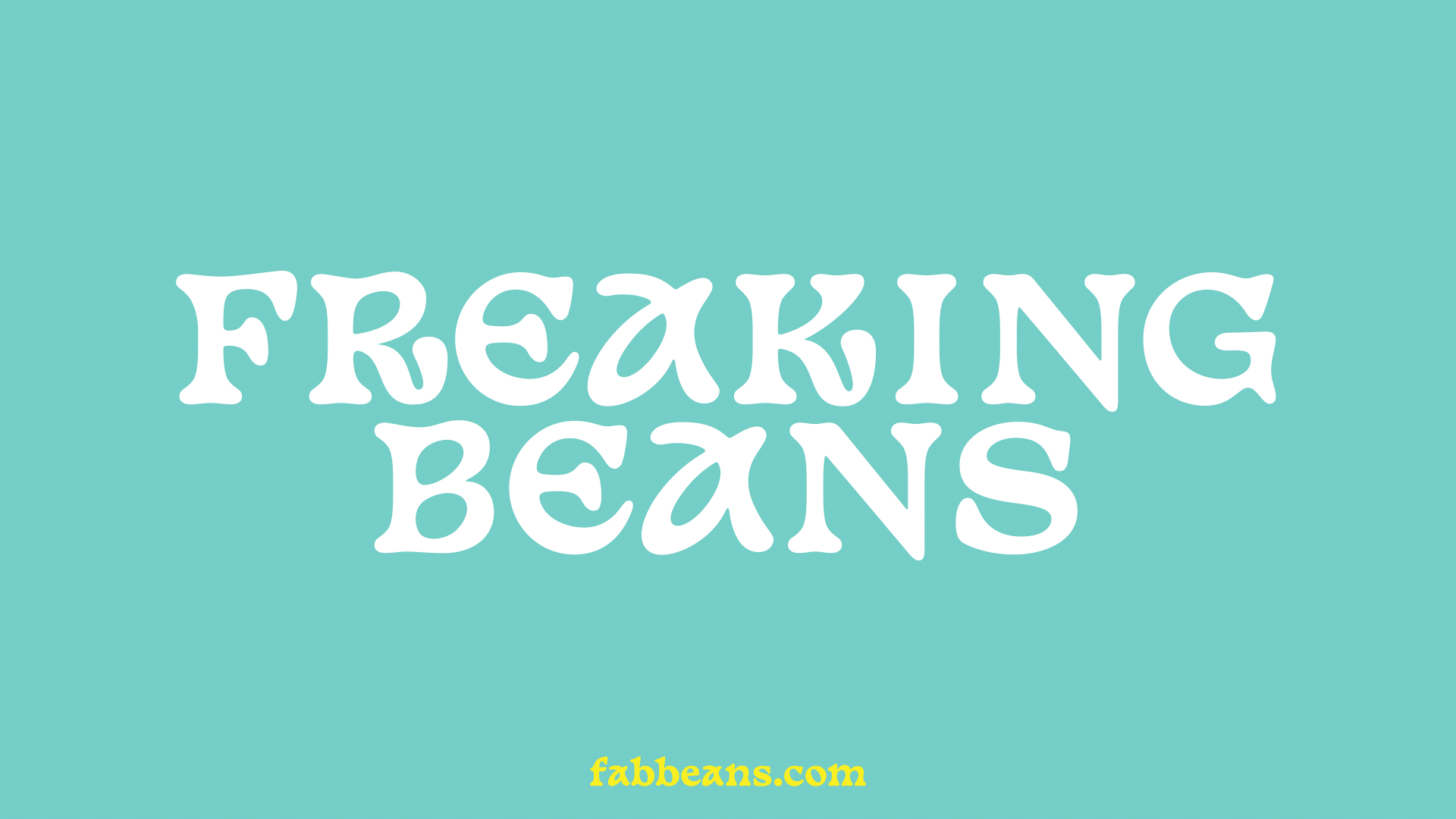
Name: FAB! is derived from Fabaceae, the scientific name for the bean family. It is an acronym for "freaking awesome beans" and carries the positive connotation of the word, "fabulous."
Audience: FAB!'s audience is made up of adventurous eaters, experience seekers, and conscientious caregivers.
Voice: loud, energetic, disruptive
This presentation includes the touchpoints created around FAB! as well as some of the information about our target audience. Our group has created a loud, energetic, and exciting identity around a product that exists in a typically monotonous market.
To see more of the process work that went behind this making of this project, visit my Behance.
This project was created in tight collaboration with Jack Raybuck and Jerry Ponzer.
The brand makes use of several different bright, hand-illustrated patterns. The abstract shapes represent some common ingredients used in cooking with beans, such as ginger and lemon.
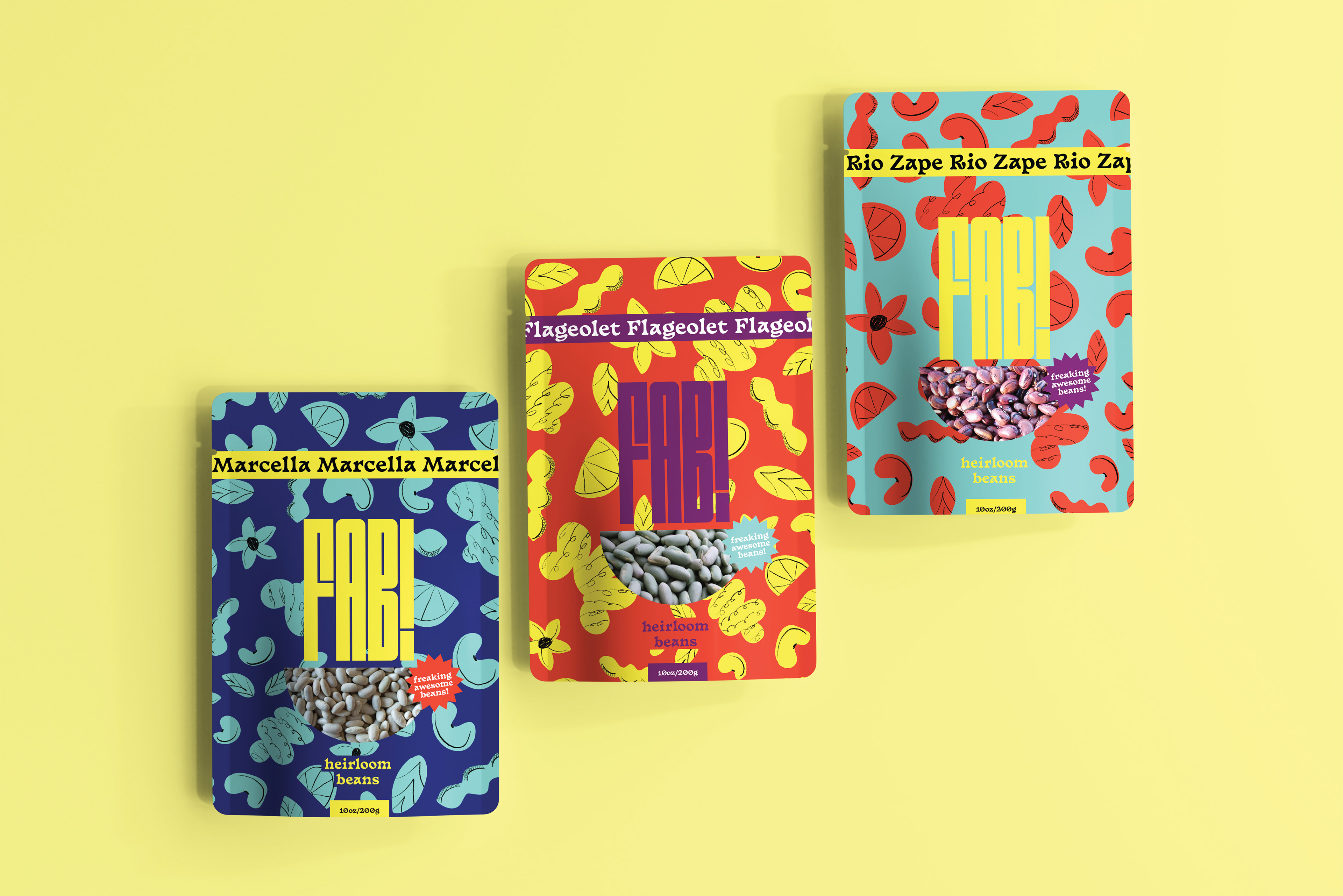
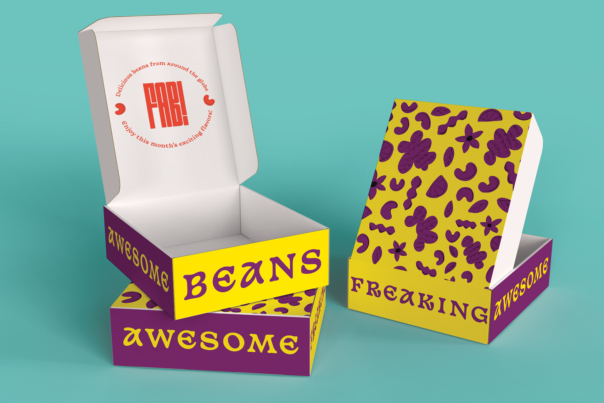
FAB! bean packaging takes visual cues from the overall brand identity. Bright and contrasting colors, large type and energetic patterns make FAB! products impossible to miss. Compared to the competition, FAB! positions itself as the bean brand that is truly excited about the future of the market.
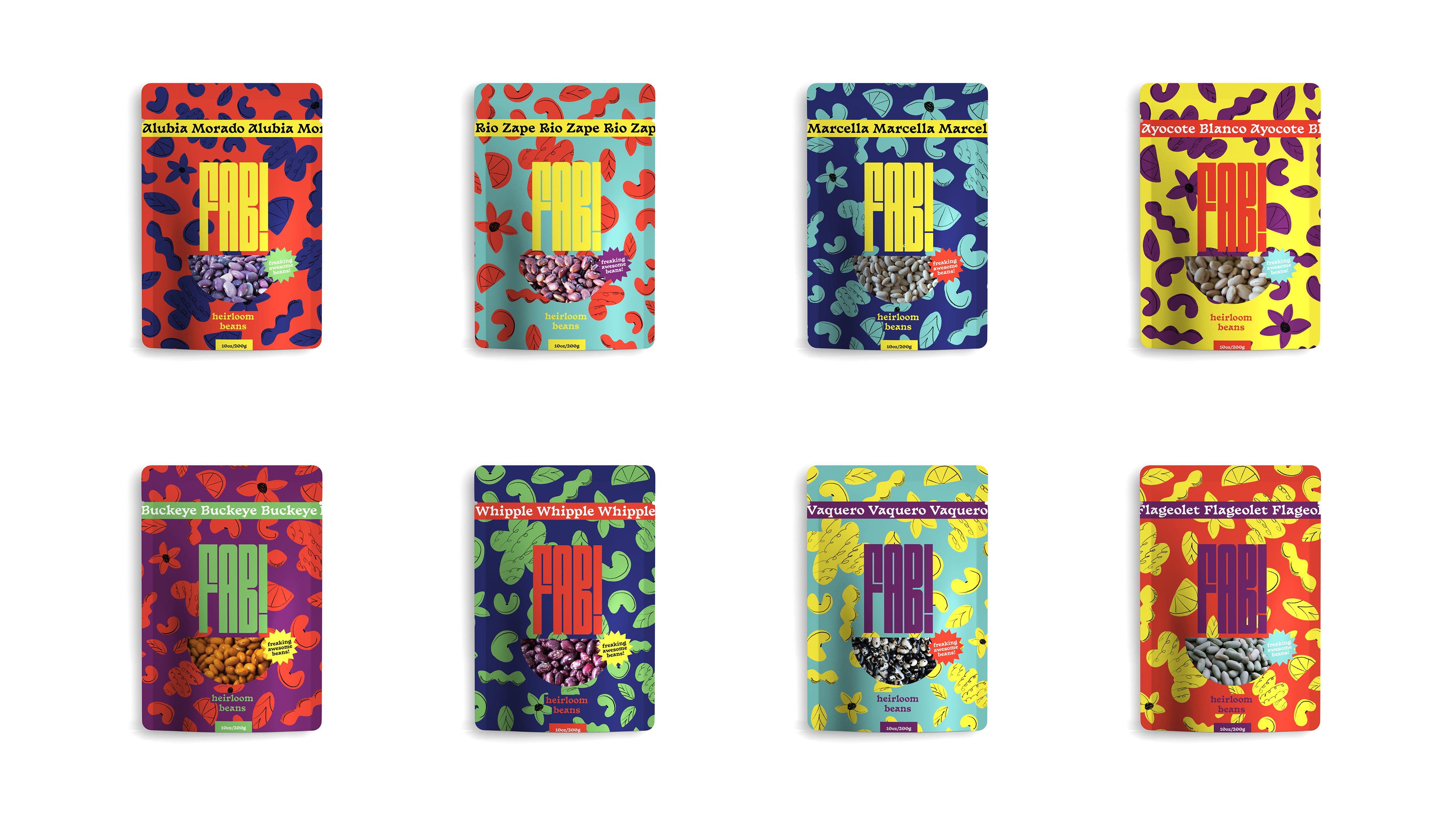
The color combinations of FAB! packaging are limitless. The semi-circle cutout window in the message subliminally references the shape of a smile because our customers won't be able to hold in their grins when eating FAB!
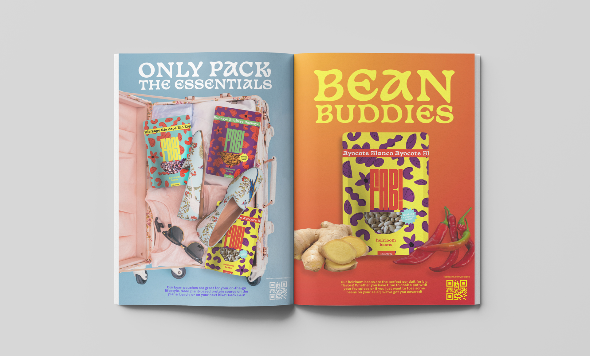
Jumping out from the pages of a magazine, our print ads can be found adding playful color to the reader's experience. The ads aim to communicate to the viewer that FAB! beans are meant to go along on every adventure. The perfect pre-cooked snack, these beans are the perfect travel buddy.
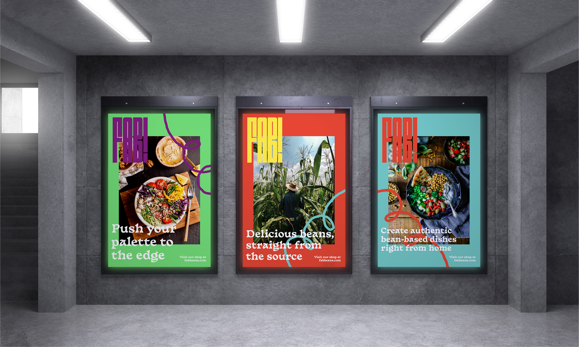
The print campaign utilizes real photography of both our partnering farmers and authentic bean-based dishes to highlight both the emotional and functional aspects of our offerings. The goal here was to create print advertisements that use color and imagery to engage passersby and generate brand awareness.
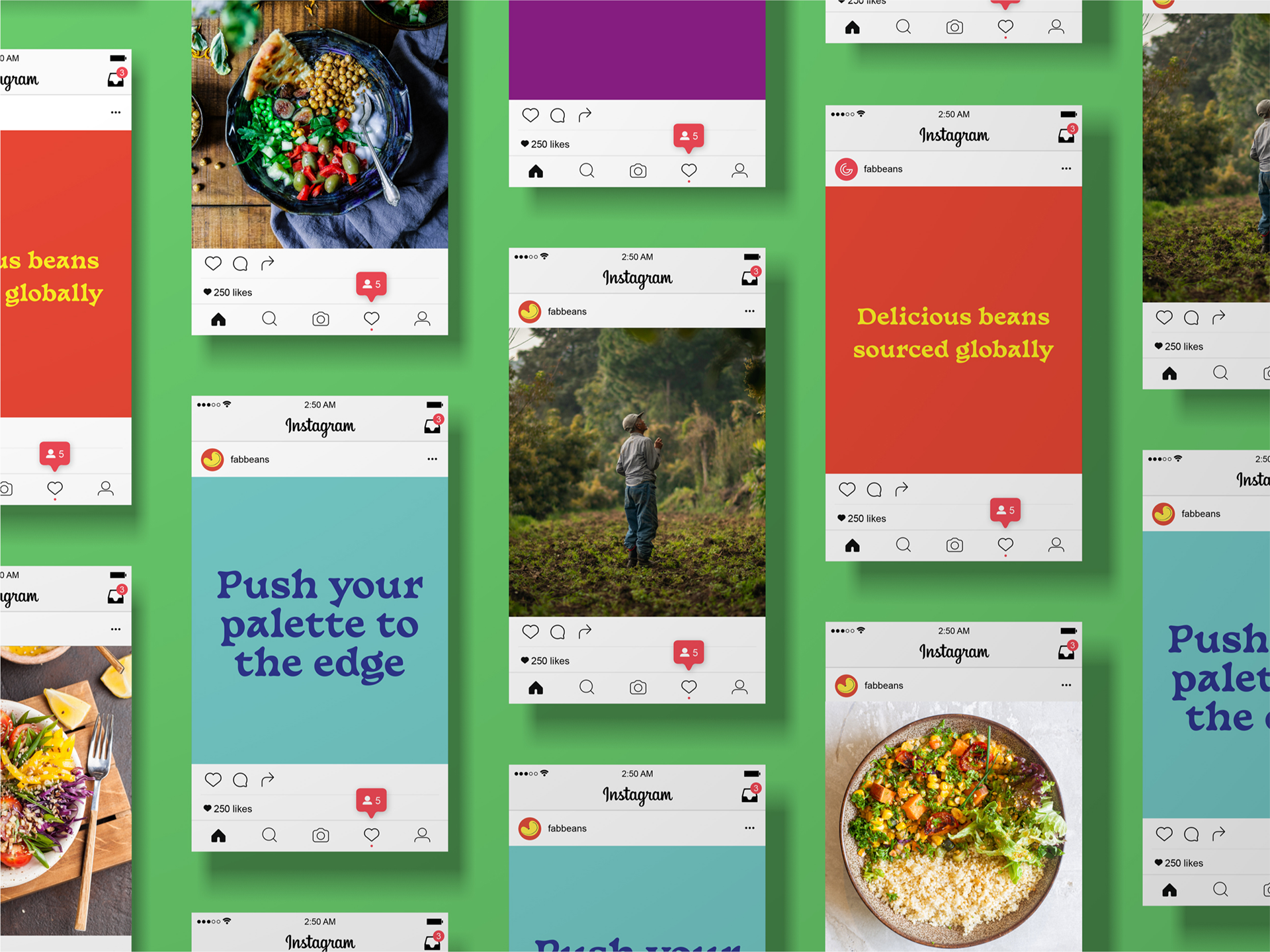
In creating social posts around the brand our goal was to highlight our partnering farmers who help bring bean to table, showcase delicious food dishes that could be created using FAB! products, and utilize our brand's messaging to engage users.
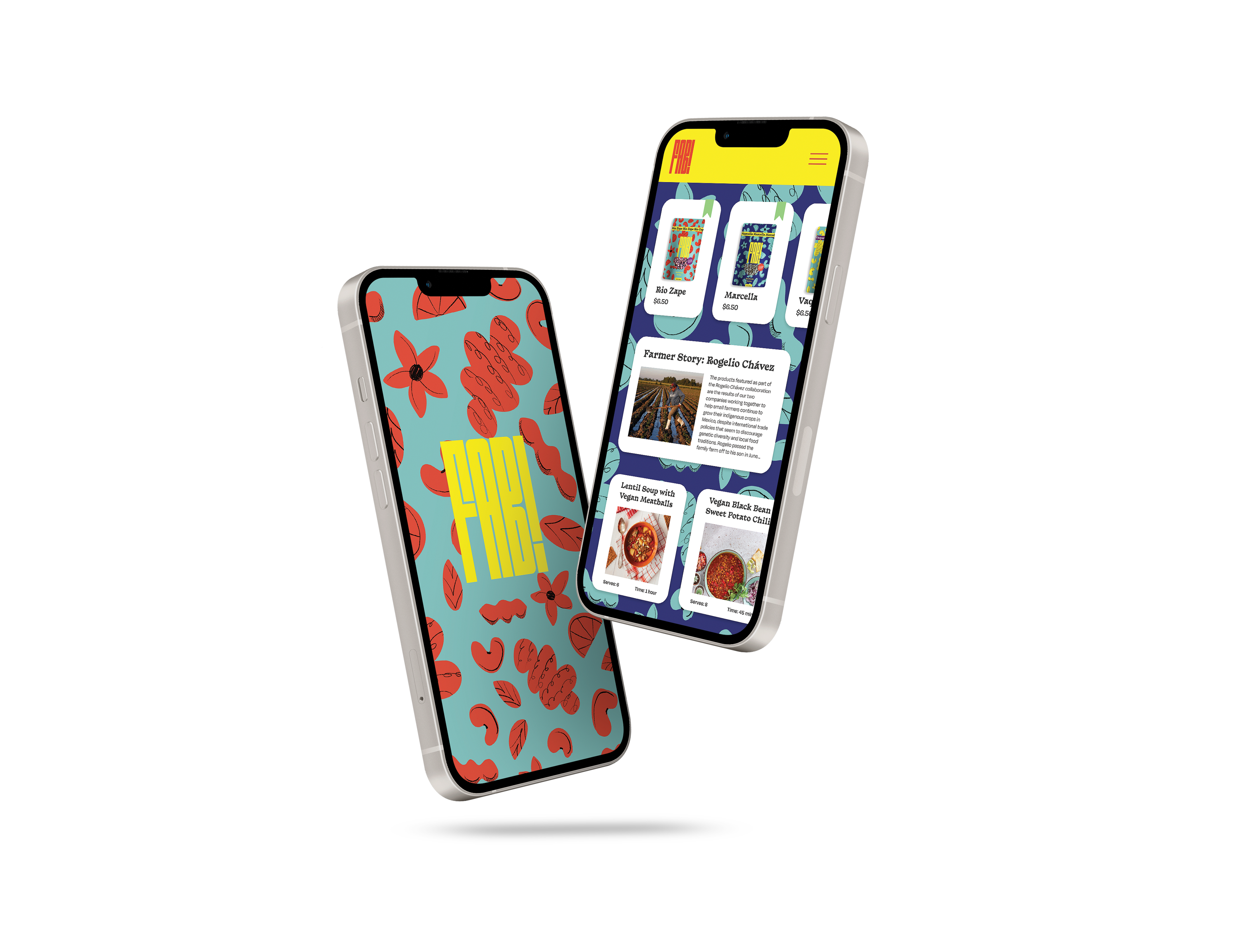
FAB! also provides an app for its customer base. The app includes an educational blog, recipes, and an on-app store to buy beans.
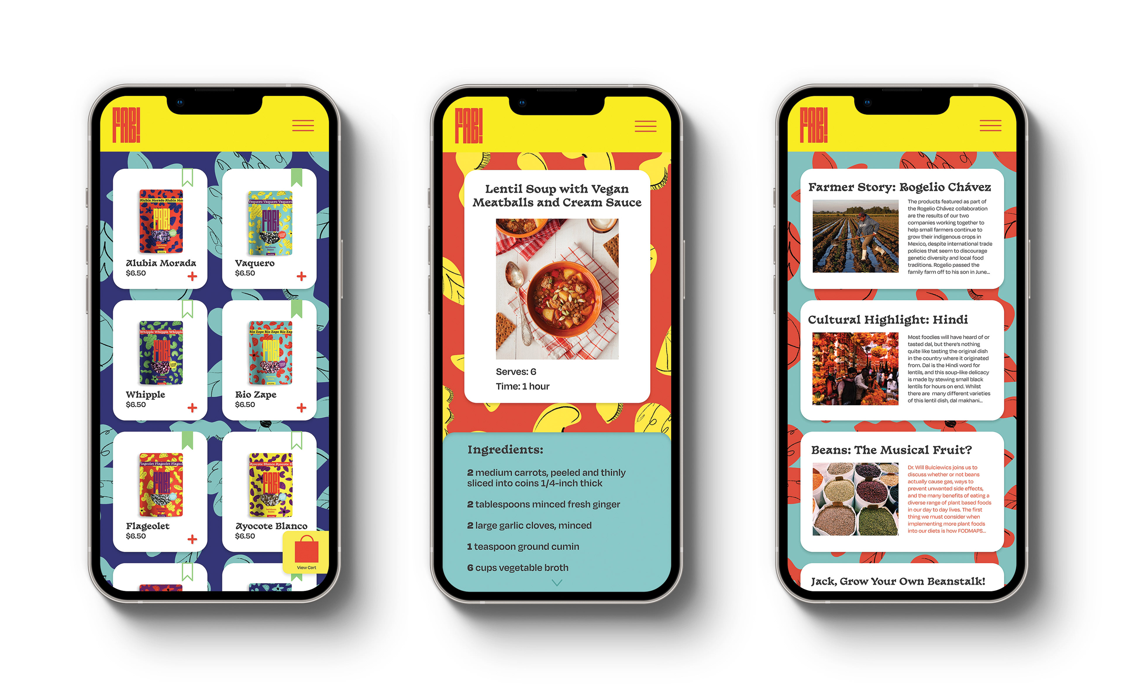
Within the e-commerce section of the app, users are able to save their favorite beans using the green bookmark feature. Saved beans then appear at the top of the home dashboard.
Hundreds of bean based recipes are available, and they can be filtered based on dietary needs.
The blog provides information highlighting benefits of beans, cultural highlights, and stories from the bean farmers.
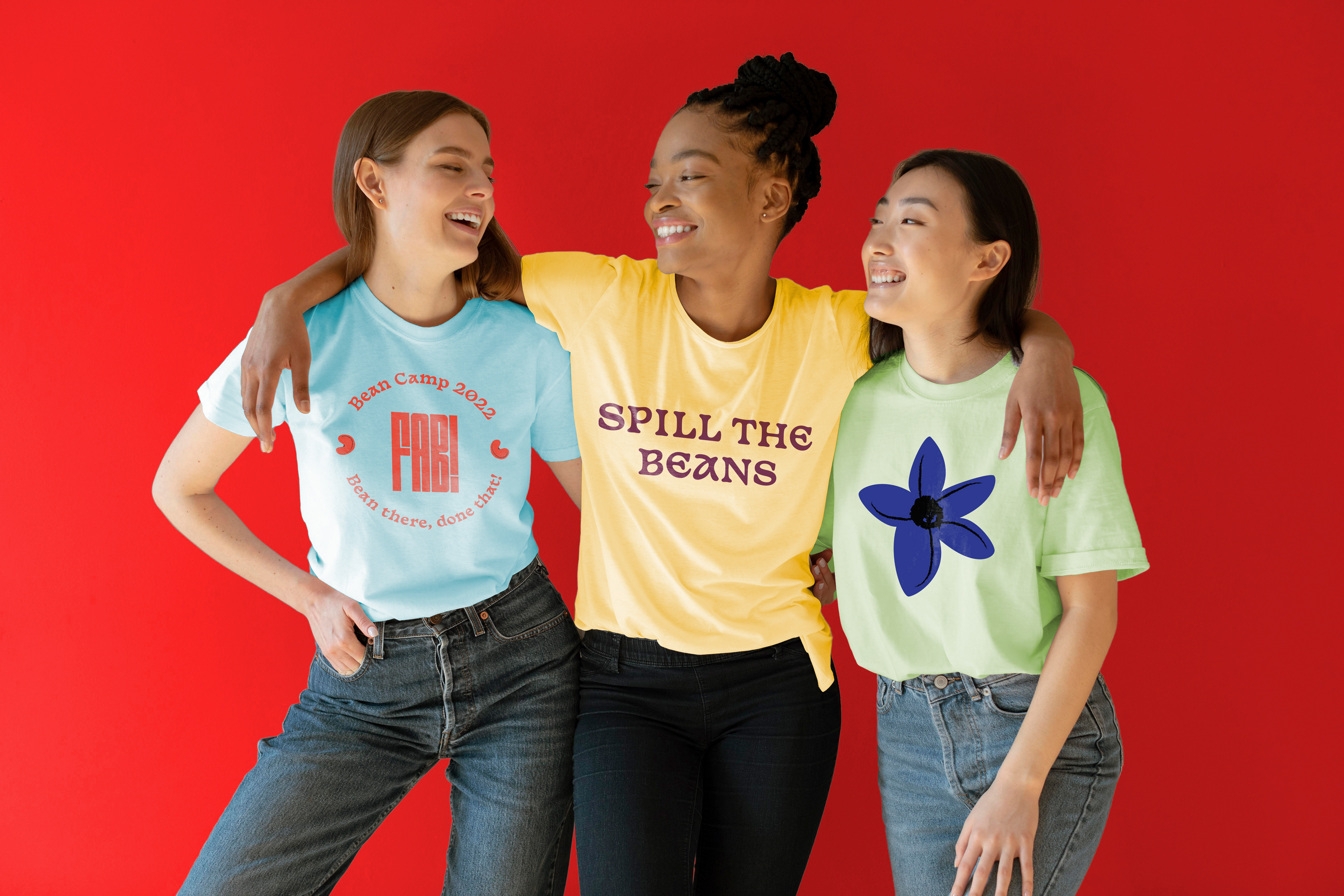
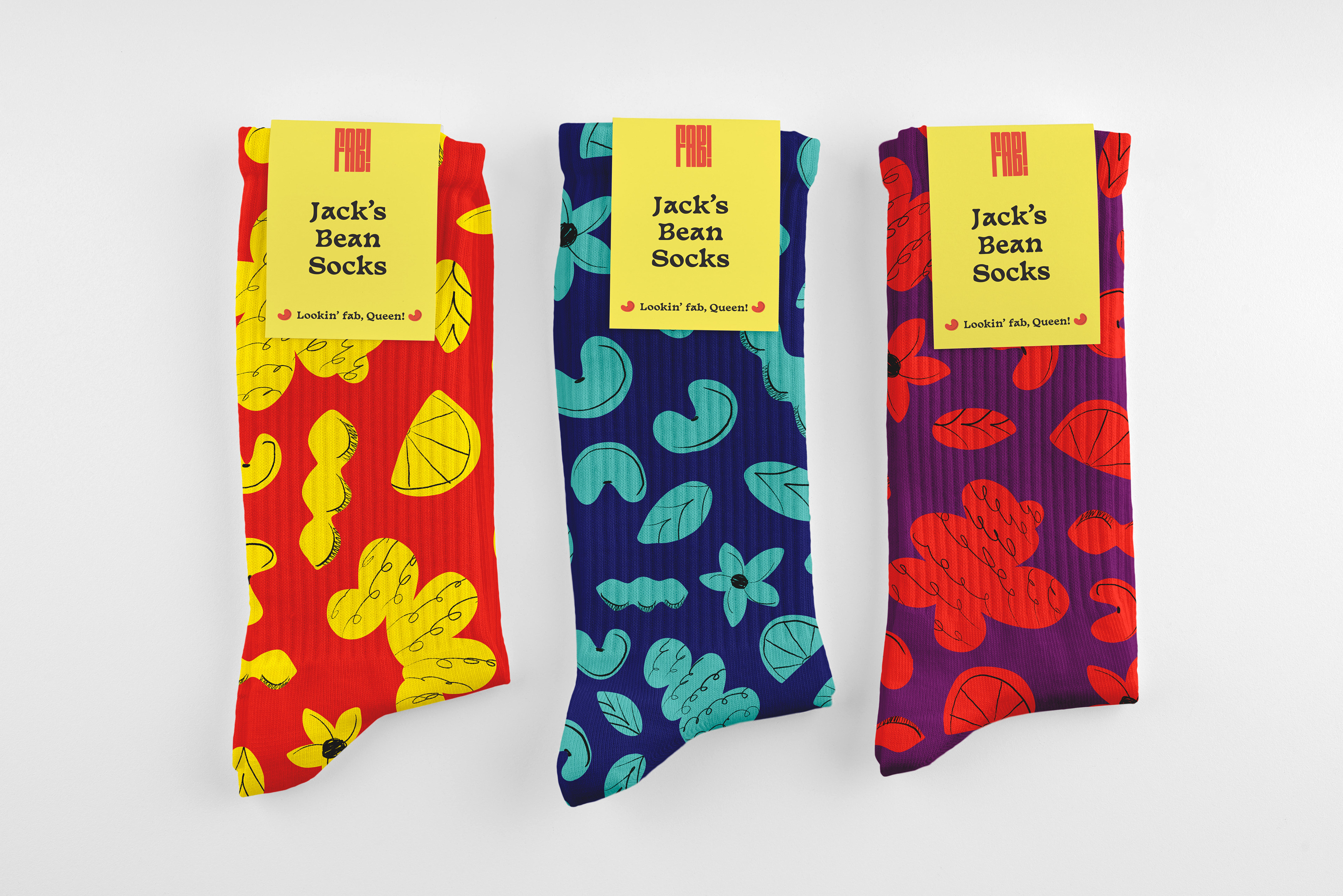
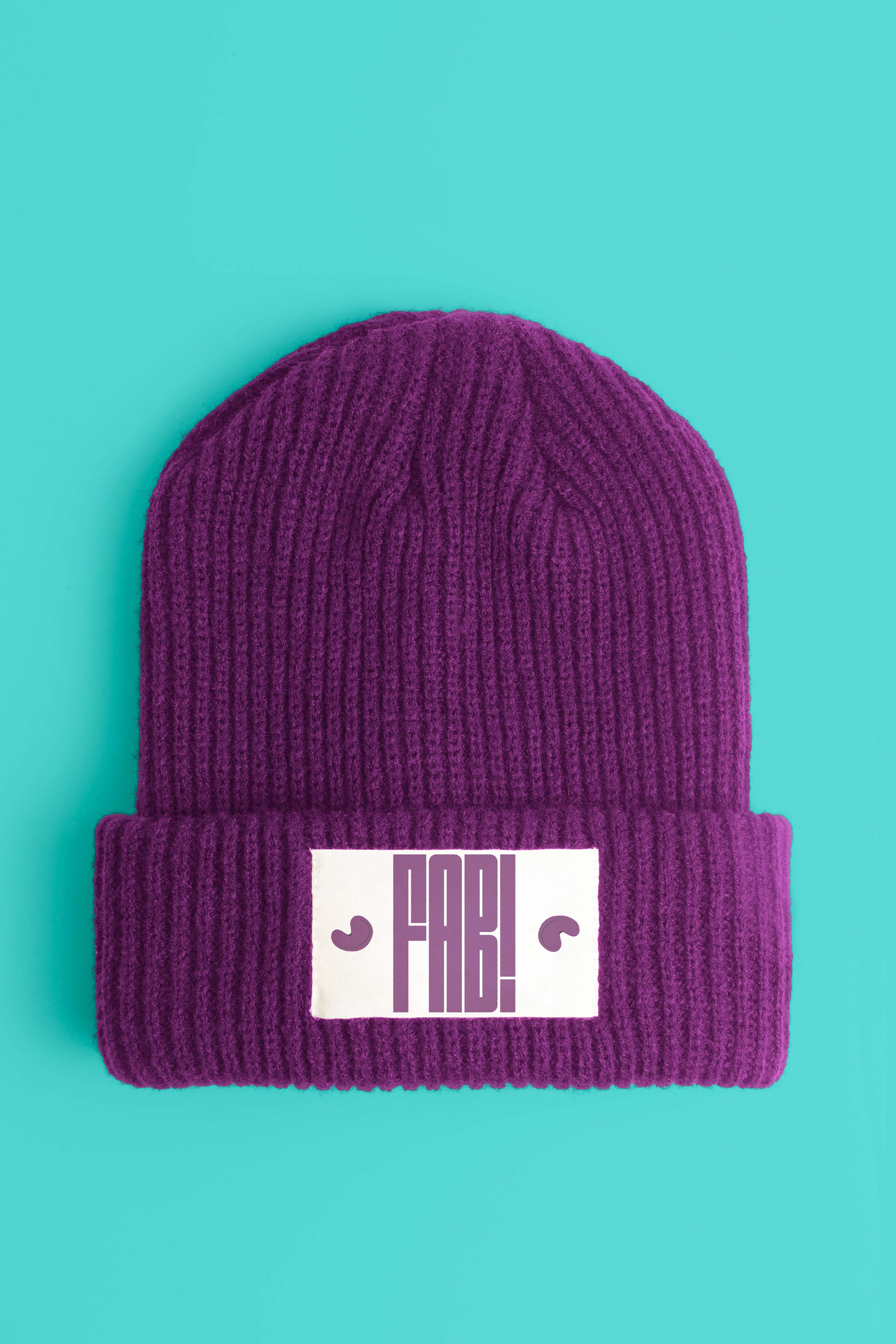
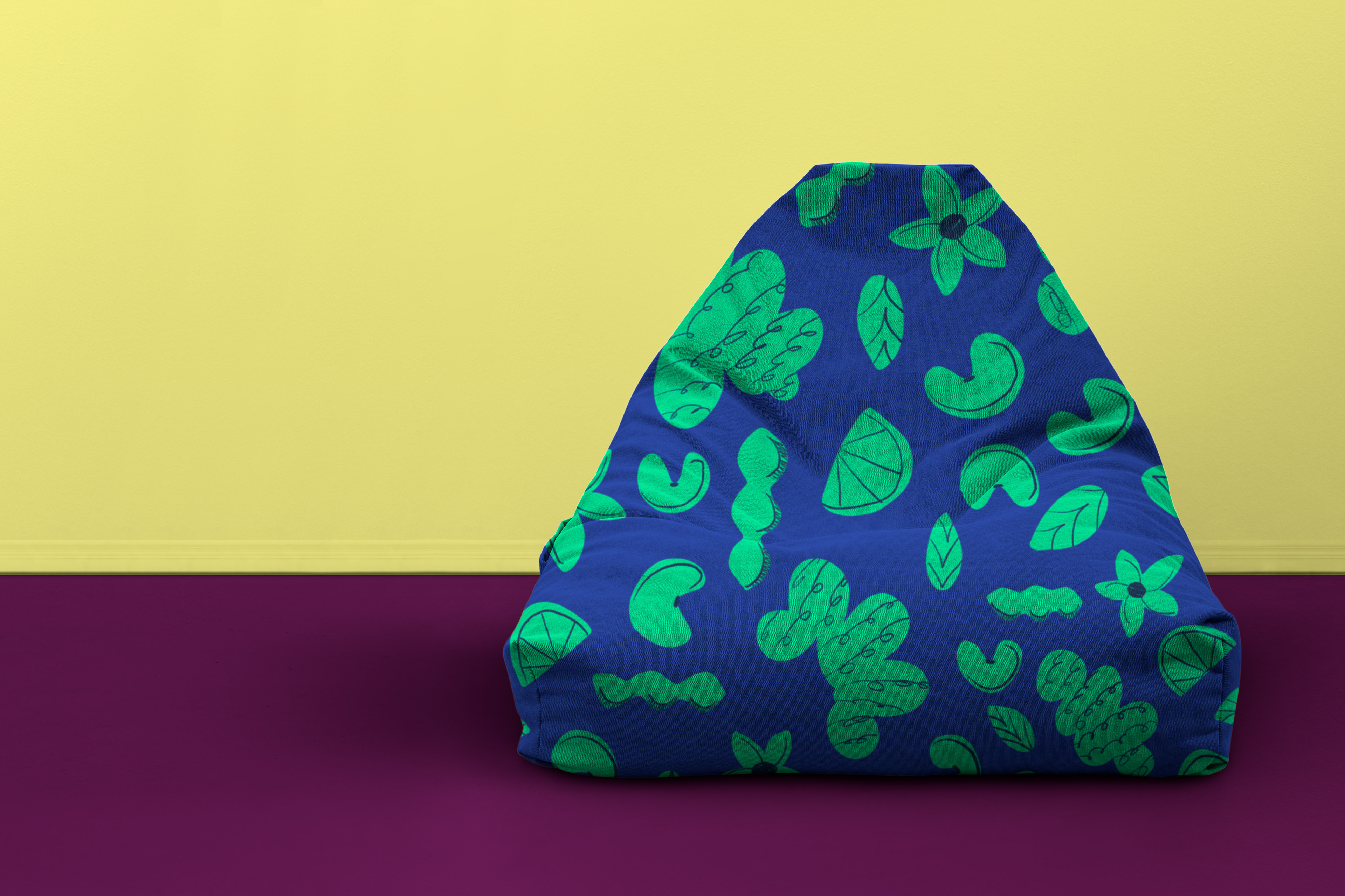
For our most loyal customers, FAB! has created a line of playful merchandise to carry-on the messaging and identity of the brand. Shown above are a few of the shirt options that FAB! customers can choose from. Below are some fabulous socks, a beanie, and beanbag chair, also available online. Not only is it an easy way to show support for a brand doing good, but they're punderful conversation starters!
The bean subscription boxes are sure to stand out in the mail, each month bringing a different color of box. The "A-word" used in the acronym for FAB! can be swapped out for other exciting adjectives such as "freaking authentic beans", "freaking alluring beans", absurd, abundant, adventurous, etc…The different months' boxes would have different adjectives.
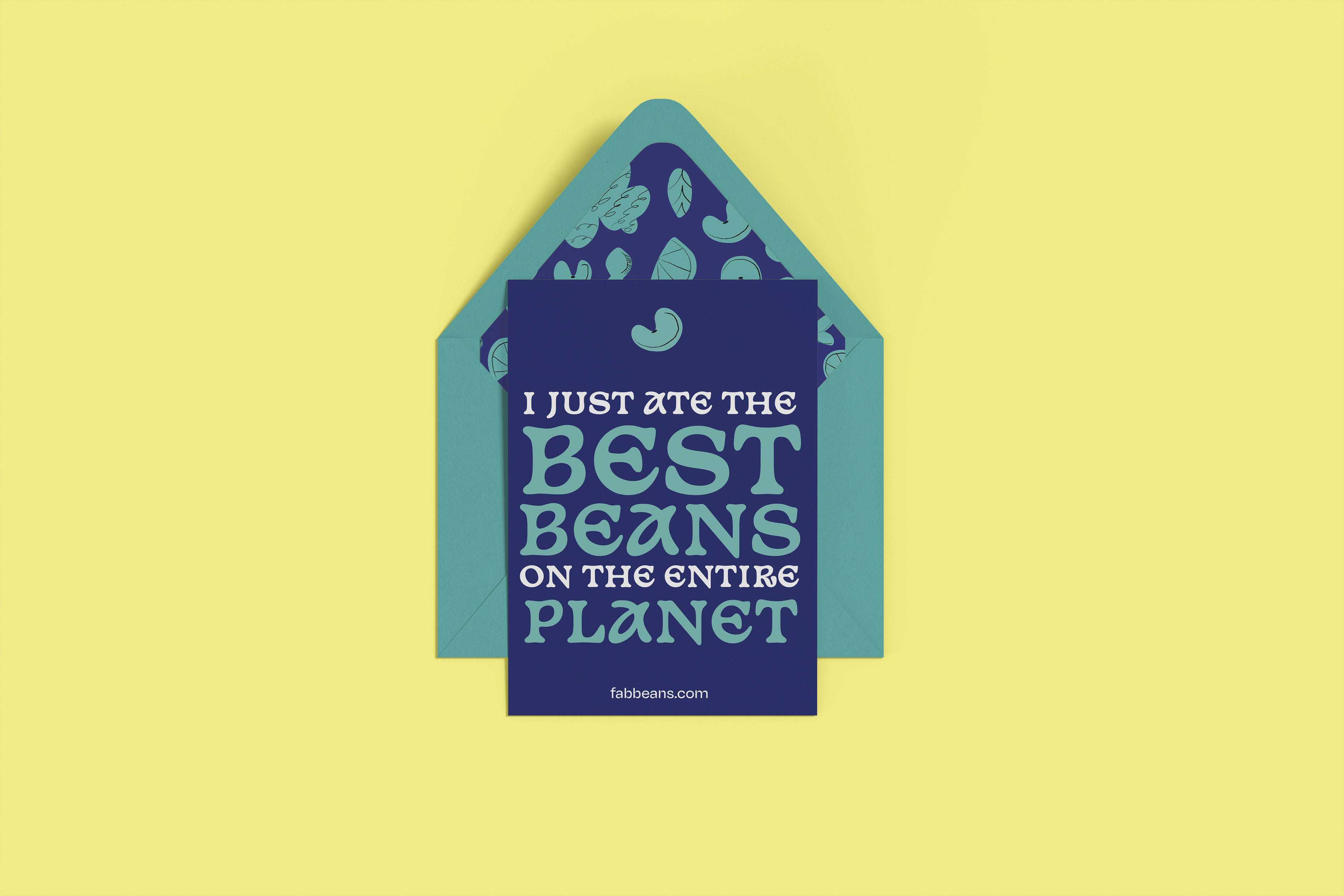
Phrases like the one shown on this promotional greeting card are another way that the brand voice speaks. It is playful and slightly absurd to get people excited.
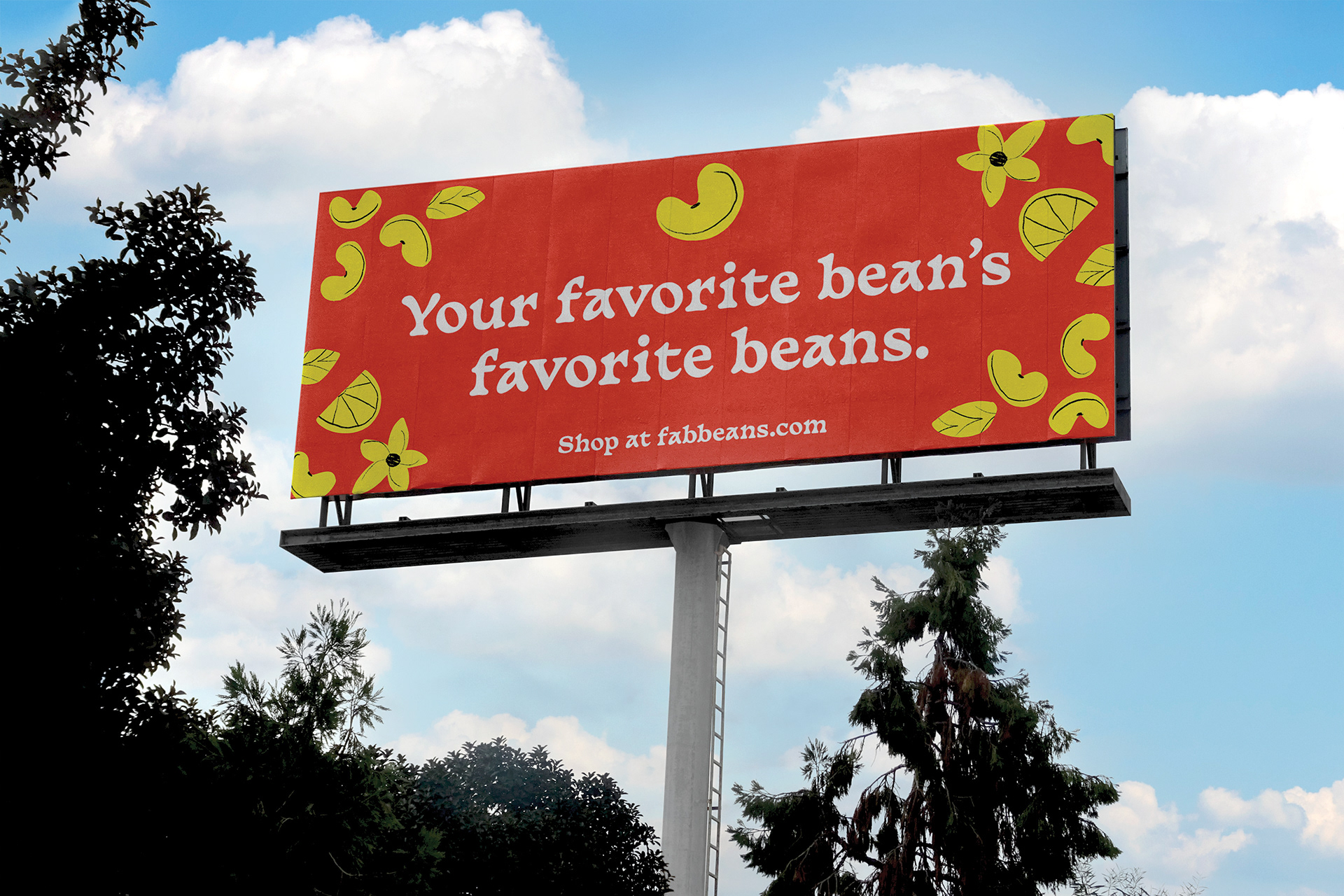
A spinoff of the phrase "your favorite artist's favorite artist," this billboard speaks volumes to catch drivers' attention in a lively way with a pop-culture reference.
Motion graphics around the brand offer another way to further strengthen the personality of FAB! Using our messaging strategy and the F.A.B. acronym, we came up with a series of "A" adjectives to describe our offerings. These taglines can be used across digital, print, and motion-based collateral, and offer a dynamic and flexible copy option for advertisements.