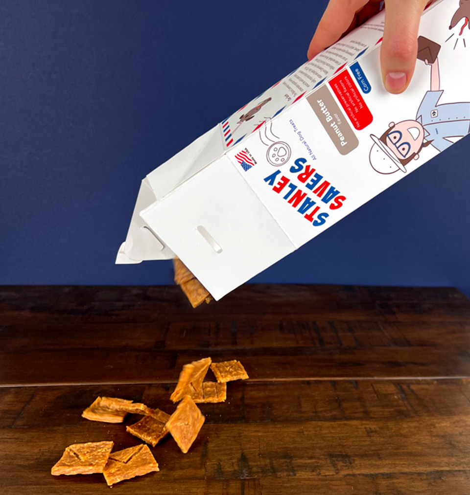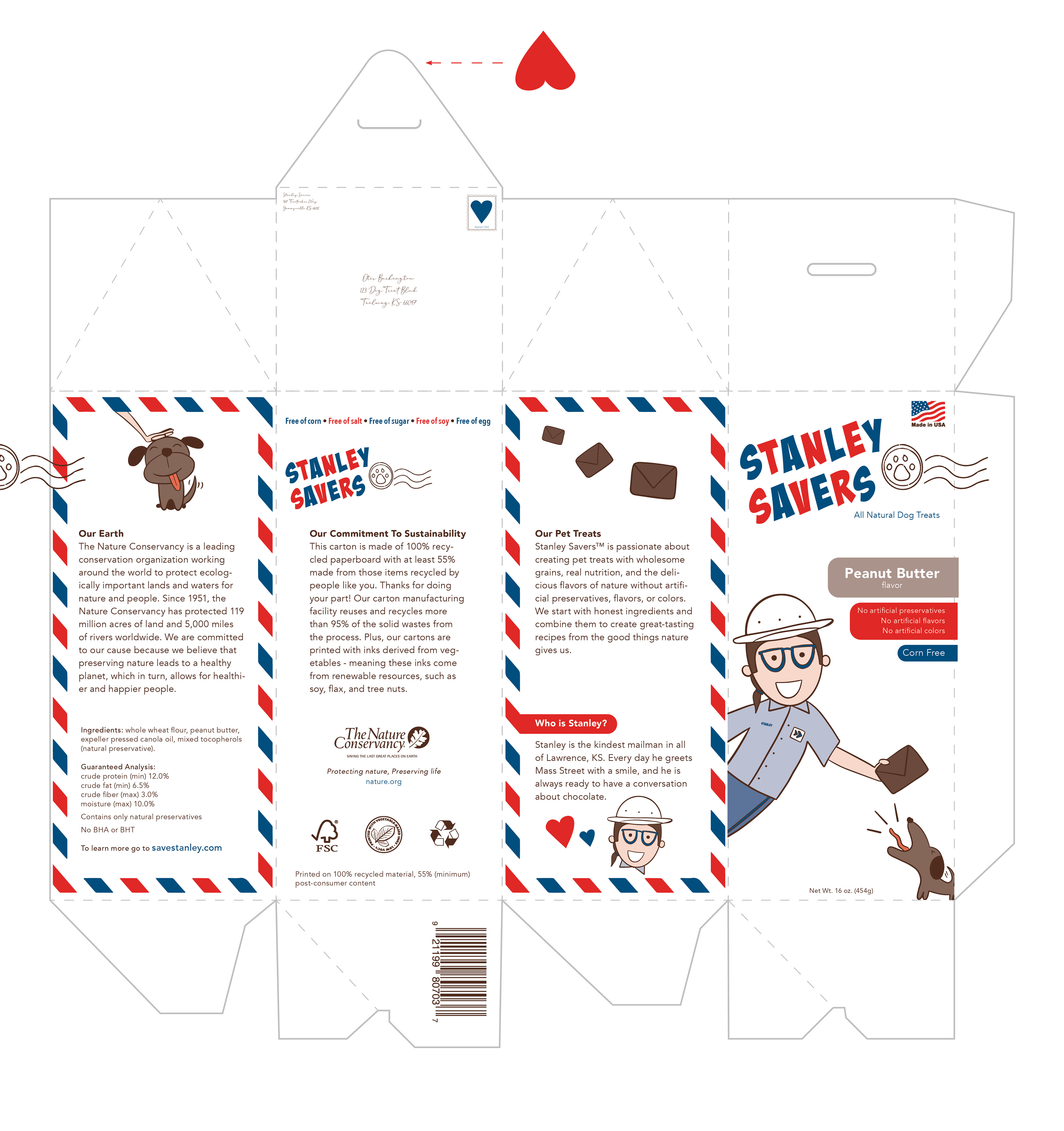
Goal: Develop a brand of dog treats, and create a package design including a custom dieline. Limit the color palette to no more than three spot colors. Fit all of the provided information on the package.
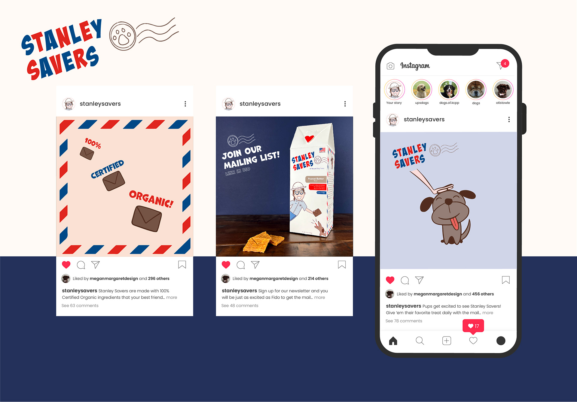
Audience: Dog parents who love their dogs like children and only want the best, cutest things for them; People who know and love Stanley or those who wish they did; People who love a good story
Voice: Friendly, warm, wholesome, comfortable, familiar
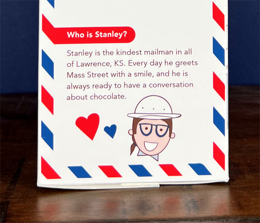
This is Stanley.
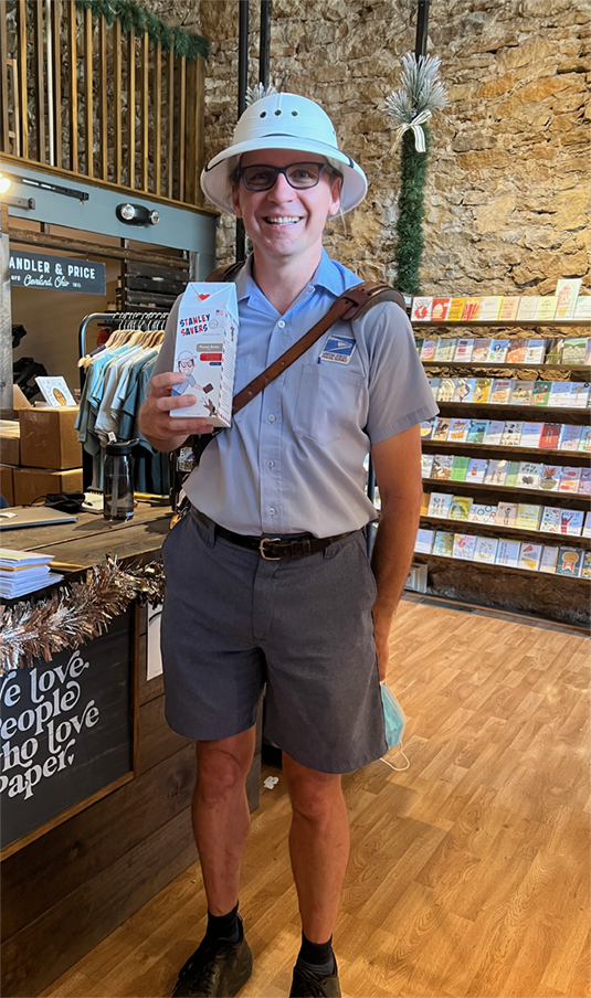
He is the mailman on Mass Street in downtown Lawrence, KS.
He is the most kind-hearted man you will ever have the privilege of meeting. He is never too busy for a smile and a chat about chocolate. He makes baked goods for his favorite downtown employees, and takes care to know every person by name.
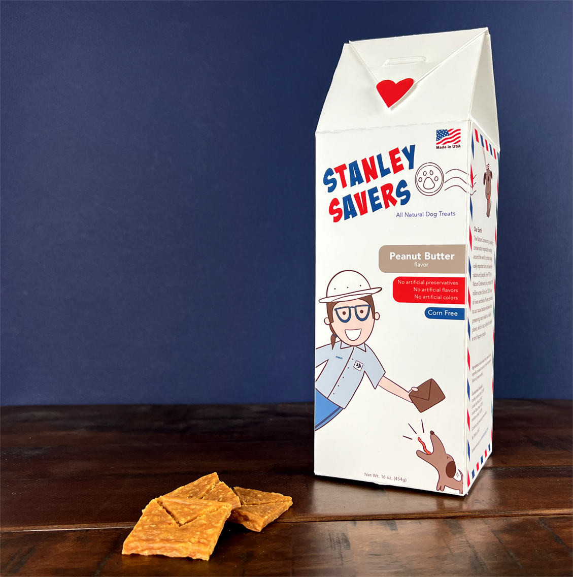
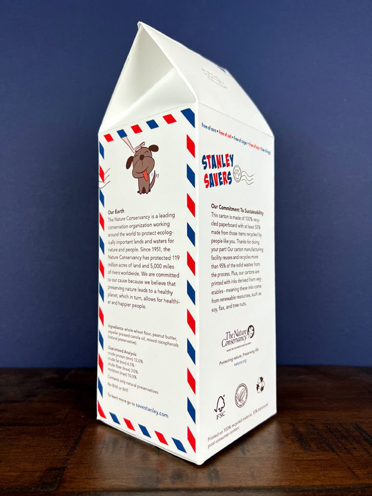
He inspired this brand story: The brand, Stanley Savers, delivers smiles to many. Its mail-themed graphics give a sense of nostalgia and excitement to consumers while telling a story of how Stanley the Mailman was saved from a seemingly ferocious puppy.

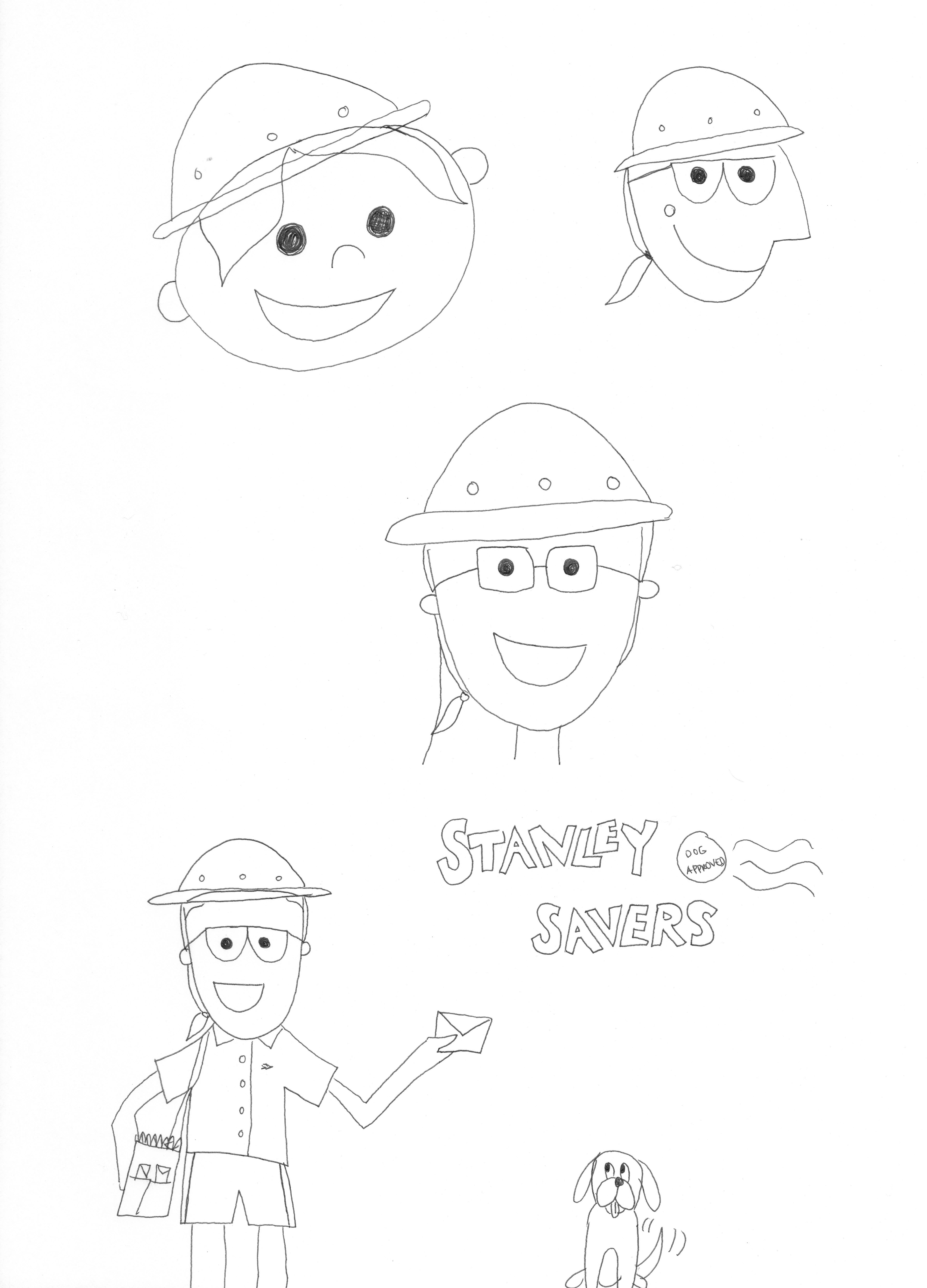
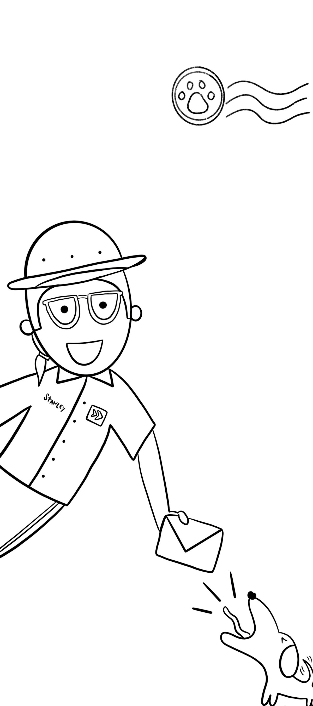
Initial Sketches: I was inspired by the look and feel of vintage cereal boxes and their child-like characters. I started my sketching process with pen and paper and then transferred them to Procreate on my iPad.
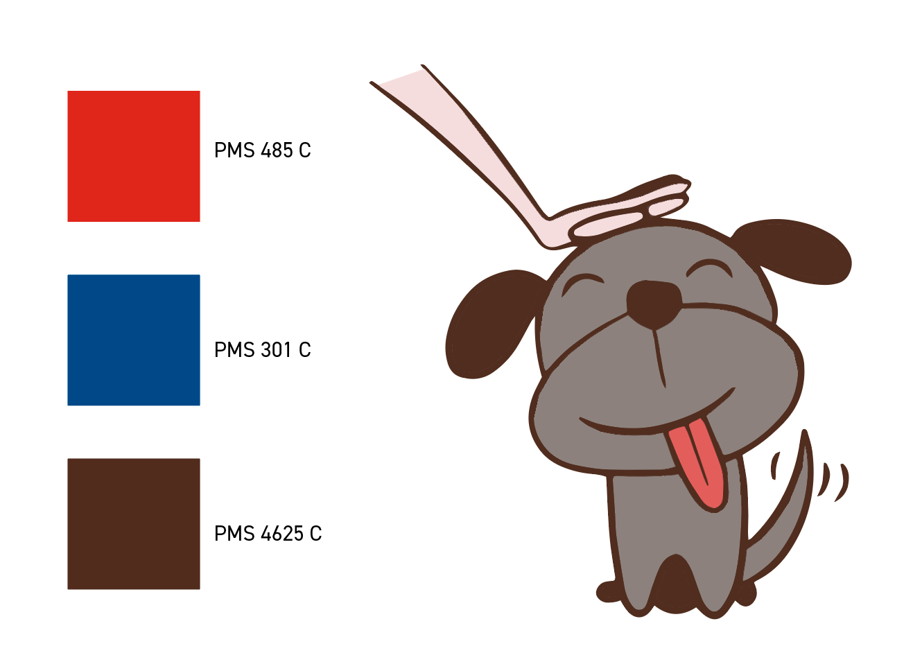
Color Palette: Using only three spot colors, I selected hues that would work at varying opacities to achieve the look I wanted.